Icons
All icons in the library are divided into 4 groups. Each group is passed to the library through their interfaces by providing them as parameters in DxChartsTheme.
To define an icon in the application, the class androidx.compose.ui.graphics.vector.ImageVector is used. Each icon's getter has the @Composable annotation.
interface CommonIcons {
    /...
    val Ok: ImageVector @Composable get
    /...
}
How to replace default icons with custom ones you can find here
Tables of icons used in the library:
- Common Icons:
These icons are used throughout the library for various common actions such as erasing, adding, deleting, etc.
| Value name | Default value |
|---|---|
| Erase |  |
| Bin |  |
| Tick |  |
| Back |  |
| Close |  |
| Search |  |
| RightArrow |  |
| RemoveText |  |
| Ok |  |
| Add |  |
| Delete |  |
| Plus |  |
- Studies Icons:
These icons are used in the studies section of the library.
| Value name | Default value |
|---|---|
| LineType |  |
| ListItem |  |
| ListItemSelected |  |
| FavStudies |  |
| FavStudiesSelected |  |
- Toolbar Icons:
These icons are used in the toolbar of the library.
| Value name | Default value |
|---|---|
| Search |  |
| Drawings | |
| Studies | |
| Trade |  |
| Settings |  |
| Magnet |  |
| Brush |  |
| LineWidth | 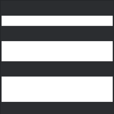 |
| ColorPicker |  |
| Plus |  |
| TextSize |  |
- Top Bar Icons:
These icons are used in the top bar which is shown when drawing mode is active of the library.
| Value name | Default Value |
|---|---|
| ArrowBack |  |
| ArrowForward |  |